
Acqua di Parma, the brand that embodies Italian lifestyle, has chosen the creative vision of artist Clym Evernden to reinterpret its iconic fragrance Colonia in a unique and original way. An eclectic protagonist of the contemporary art scene and multi-award winning artist and art director for some of the world’s most prestigious brands, Clym Evernden is known for his trademark fluid and graphic black ink lines that characterise his signature style, as well as for his bold and radiant use of colour. Clym is at ease with all types of media: from paper drawings, set design, video production and installations to multimedia works. His poetical animated folded stories and clever, imaginative posts have won him a large audience of more than 85,000 followers on his Instagram account @clymdraws.

Artist Clym Evernden
Who is Clym today?
I’m an award winning visual artist whose work encompasses creative commissions with top tier brands, and personal projects – often centered around an imaginative and observational concept, produced for my audience @clymdraws instagram. Most of my work involves my signature black ink brush line. I grew up in the countryside and always enjoyed creating observational drawings – often of nature. I studied BA Fashion Design Womenswear at Central Saint Martins in London, and after working as a designer I developed my portfolio and became solely an artist.
Why Acqua di Parma?
I’ve always loved the brand Acqua di Parma. Italy is one of my favourite holiday destinations, and the brand embodies the style, sophistication, and intoxicating atmosphere of the parts of the country that I love. It’s very important for me to collaborate with companies who have a genuine and authentic product and story behind the brand. I also felt that for a company with such a strong and established visual identity, it was an honour to be asked to introduce my own hand and collaborate.
What’s your favourite Acqua di Parma fragrance?
To be honest I’ve yet to find a fragrance by Acqua di Parma that I don’t like, all the scents are so evocative and have a natural undertone, however Colonia would have to be my favourite. I also love the large square block candles, they are wonderfully architectural and make a fantastic addition to my studio both visually and scent-wise.

What does Acqua di Parma represent to you?
Beyond the product range, Acqua di Parma represents a desirable lifestyle. The atmosphere of the brands evokes discreet luxury, a level of refinement without being stuffy or elitist, which I think is very modern.
How does the aesthetics of Acqua di Parma match your style?
I love the aesthetics of Acqua di Parma. I’ve always been drawn to a strong graphic style, and I appreciate the simplistic, perhaps slightly deco typeface used in the branding. This coupled with the monotone label and ‘Parma yellow’ I think is incredibly effective. In a similar way my signature style hinges on a strong graphic black line, offset against a key colour choice. There is a sense of careful editing in the Acqua di Parma aesthetic, nothing unnecessary or deceptive is added and therefore creates a direct and trustworthy visual.

What are the main shared values between you and Acqua di Parma?
The way I usually work, or start the artwork for a project is simply transmitting information from the eye to the hand, and onto the paper. This direct line of communication carries a potency which is untampered and visceral and I think people appreciate that. In a similar way I feel there is a simplicity and honesty to Acqua di Parma. The core range has been developed and produced naturally, and the brand have maintained the ethos of this foundation. In my work it is also important for me to start with hand produced creation, no matter what the final production might be – such as an animation. Acqua di Parma is also hand crafted, even through to the production of the signature rounded boxes, and origin of the brand logo.
What were you inspired by? What’s the inspiration behind this project?
Italy, in particular the spacious and airy feel in palazzo style buildings, the window shutters and the natural light filling the interior from the outside. The idea of billowing gauzy curtains, and hearing the birdsong outside, perhaps seeing a few swifts dart past the window. Lightness, the romance of imagination. Something that will make people smile. I aimed to express something artful and fresh.
How did you come up with a bird?
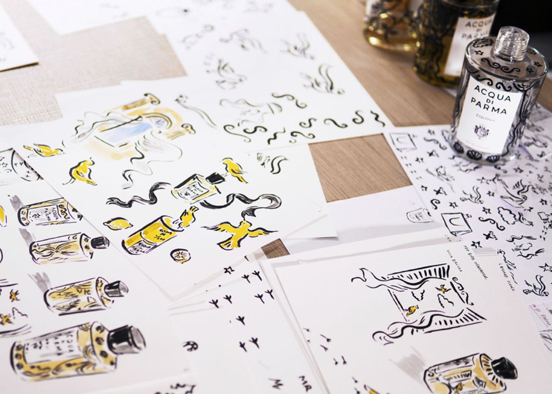
As a child I was very interested in nature, and mainly ornithology. As a result, I think I have an innate understanding of animal characteristics and movements. I wanted to create a character, something to bring life to my collaboration. A vehicle to show expression and occupy different roles throughout the project. I wanted to express a feeling of lightness of movement. I associate birds with something joyful no matter what the season, a blackbird’s song in the evening during the winter, or seeing the first swallow in spring. I came up with the Acqua di Parma bird by simply drawing pages and pages of birds until they developed into a character which I felt fitted the brand and Colonia perfectly.
What do you imagine when you smell Colonia?
It instantly makes me feel like I’ve just put on a beautifully tailored suit. The scent seems to create a beautiful juxtaposition between a feeling of nostalgia and history, and a modern and fresh energy – a ‘zing’.

Did you enjoy working on a perfume and why?
I’ve never worked on perfume packaging and branding before – it’s something I’ve always wanted to do. I love applying my work to anything three dimensional as it offers a new context. It’s interesting for me to work on a perfume because the artwork has to somehow translate something atmospheric and intangible. I also love the idea that my artwork is being applied to a product which will provide pleasure to the user every day, and each bottle will embark on its own story of ownership, perhaps travel, and love. In addition, I hope that people will reuse the bottles and boxes, and these will have longevity and perhaps even be passed down through generations. In this way I hope to have left my mark on the lineage of Acqua di Parma and its customers, and in doing so be part of the history of the brand. This would make me very proud.

How would you describe the decorations along the pack and the bottle?
The design of the bottle shows the bird character I’ve created engaging in various activities and scenarios. I developed the character to show little stories of joyful experiences, at one point on the bottle he’s skiing, then shopping, perched on a window sill admiring the view. I wanted the design to flow from one scene to the next, so the brush stroke lines create a sort of organic rhythm around the bottle. I also wanted to produce a magical feel whereby the bird interchanged between land, sky and stars. On the centre back of the bottle is my signature. The packaging design shows the bird character as more of a continuous repeat print, interspersed with my signature which creates a kind of graphic motif amongst the repeat.

Clym Evernden’s Biography
Clym Evernden is an award winning artist and art director with a unique creative eye. His signature ink-based style has evolved to encompass mixed media, animation, and set design. A graduate of Central Saint Martins, Clym studied BA Fashion Design Womenswear prior to working solely as an artist. Clym’s versatile observational skills mean that he can represent a broad range of themes, and find an inspired and engaging angle on his subject matter. Clym’s work instantly presents a narrative to the viewer, whether it be a specific style, atmosphere, or wit, with effortless clarity – making him an in demand and indispensable collaborator. Clym has created artwork, animations and directed marketing campaigns for global brands such as Samsung, Louis Vuitton, Audi, Net-A-Porter, Moët Hennessy, Valextra, and been published on a variety of platforms including TV and onsite installations. Clym has created large scale set designs for Tiffany & Co, The New York City Ballet, and window designs for Michael Kors and Fenwick. Clym recently produced a large scale street take-over project in Seoul, worked as artist in residence at The Carlyle Hotel, New York, and headed to Tokyo to create a unique series of portraits live at a Michael Kors VIP event. Clym enjoys a large audience @clymdraws Instagram, and creates imaginative and ingenious posts such as his recent series of ‘folded stories’ for his followers. Clym’s folded story ‘Evolution’ currently has received over 6 million views on Instagram. Clym is also a respected influencer and personality, and has starred in campaigns for Giorgio Armani, GQ, Margaret Howell, and Matches.


I found your internet site from Google and also I need to say it was a great locate.
Thanks!